 |
Recently, I visited northern Michigan (where I spent the first 23 years of my life) and visited an old haunt, the Jordan Valley Watershed. Very fond memories of this wilderness area made me want to go back and attempt to photograph the beauty I remember so well. While there, I couldn't help but think how similar it is to my southern Florida haunts. The photo above helps illustrate this point. The dominate color is green, but with varying tones, shades and tints. This is, by definition, the meaning of monochrome.
The term monochrome is defined is many ways, but basically it refers to one color or hue and all its variations of light. Paint swatches or sample cards at a paint store are a good way to view monochrome. Consider the photo above and the variations of green from dark to light. If it were a painting, the painter would create those variations by taking basic green and adding black (shading), white (tinting), or gray (toning). Below is an example using orange as the basic hue.
While there are obvious differences between south Florida and northern Michigan wilderness, what strikes me as being similar are the monochromatic color schemes (the exception is in the fall when Michigan trees are bright with reds and yellows). At least that is my photography experience. Green (northern hardwood trees) dominates summer in northern Michigan and here in Florida, water and sky are the primary elements, so blue and all its monochromatic colors dominate.
Given the location where I photograph, it is no wonder most of my images are monochromatic and restrained nature scenes. Why is one compelled to photograph such subtleties that struggle to get the viewer's attention? After all, dramatic scenes of nature is what captures the viewer's eye most consistently. Consequently, photographing the simple and unpretentious side of nature is a test in design and composition. It has led me to study color theory and try to figure out why I am drawn to these scenes and more importantly, how I might capture them in a compelling way.
That has led me to examine the concept of monochrome and how a photograph might use it to its advantage. Color combinations alter the connection between visual sensory input and the brain. What might be considered opposite of monochrome is the concept of complementary colors (yellow and blue, for instance). When applied to a photograph, complementary colors boldly stand out and stimulate the brain; whereas monochrome colors are subtle and calming.
 |
| The keel-billed toucan's bill draws the viewer's attention with its complementary colors (green and red, orange and blue). Viewed best when its surroundings are monochrome and subdued. |
Compelling images are those that lead the viewer's eyes into the scene. Bold contrasting colors do this very well, such as with the keel-billed toucan above. But how do you grab the viewer's attention with a monochromatic image? Applying subtle variations in tones, shades or tints does not challenge the eyes; rather, monochrome color schemes present visual harmony and simplicity. This is very pleasing, but not necessarily an attention grabber. With that in mind, I use some rules of composition and attempt to compose a scene with a monochromatic palette (either primarily blue or primarily green) that not only leads the viewer into the scene, but also invites them to stick around for awhile.
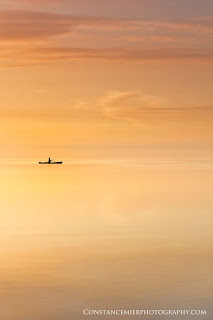
Below are four examples of monochromatic images shot here in south Florida. Note the similarities across these very different looking images. First, there are many variations of a single color that form patterns throughout the image, leading the eyes through the image. Second, each image has a contrasting subject that serves as a focal point. This simply adds interest and initiates the viewer's attention. Third, the subject is strategically placed in the composition using the rule of thirds. Placing a subject off-center (like one third from the top or from the left) gives the image a dynamic quality and draws the eyes into the remaining image.
Basically, I attempt to compose an image that can be viewed as such; 1) capture the eye's attention with a subject that stands out, 2) invite the eyes to leave the subject and continue moving through the image, and 3), visually "stepping back" and taking in the entire scene. Did the above images do this for you? Let me know your thoughts and how I can improve them.
To learn more about how I capture scenes like these, please visit my YouTube channel and my "Getting the Shot" blog.


If you are searching for reliable ways to sell used electrical equipment buyers in Fort Worth TX, you are not alone. Many contractors, industrial businesses, warehouses, and electrical companies in Fort Worth often end up with surplus, outdated, or gently used equipment that takes up valuable space. Instead of letting it collect dust, selling your used electrical equipment to trusted buyers can help you recover cash while clearing your inventory efficiently.
ReplyDeleteSell Used Electrical Equipment Buyers in Fort Worth TX